The social media trends worth preparing for in 2027 have two jobs: helping people discover your business and giving them something they actually want to watch. We’ll look at video, social search, original content, communities and posts people share because they enjoy them. Real campaigns will lead the way. Expect inflated lettering, food you can almost smell and brands with a cheeky streak.
Social media conversations tend to start with the latest format and end with a task list: another reel, another carousel, another audio track. Meanwhile, the question that matters is still waiting. Why should someone give your business a second of their attention when hundreds of other posts are right in front of them?
We’ve chosen eight directions for businesses looking to build a presence and generate business through Instagram, TikTok and other channels. Projects on Behance and Awwwards let us study how individual pieces are put together; platform documentation provides context on formats and discovery. The applications for small businesses are our own recommendations. A café and a consultancy can learn from the same project, even if their content and the way they sell are very different.
This edition was written in October 2026 to help you plan for 2027. We keep the original year of each reference and distinguish documented developments from our interpretation of how to use them. The selection doesn’t depend on guessing the next algorithm. Understanding what you need to show, and the resources you have to do it well, is more useful.
Let’s look closely, take things apart and turn the ideas into something practical. When you’re ready to build a content calendar, combine this selection with our social media post ideas for local businesses.
1 Video and motion with a recognisable signature
You could cover the logo on a post and still know who’s speaking. That’s a useful test for social media in 2027. Colour helps, but so do the way a headline appears, the pace of a video and the style of humour. When every piece has a different personality, the brand has to introduce itself all over again.
The Duolingo Brand Motion Toolkit, presented by Noodle Studio in October 2025, has one detail we particularly like: it helps the team keep producing. It includes three aspect ratios, several text animations, a 3D phone and customisable elements. Words, colours and screen recordings can change without rebuilding every video. The owl gets loud; the production system underneath stays organised.

Another useful reference is the Dropbox Brand system, developed with Daybreak Studio and featured on Awwwards. Its demonstrations show how the same shape can feel different when its movement changes. For a brand, that decision can be the equivalent of speaking calmly, energetically or with a little mischief. Animation has a tone of voice too.
For a small business, a useful version of this idea is a set of pieces that suits the work it does. A brief opening to introduce a question, a layout for a product demonstration and a closing frame that identifies the professional. Each video starts with the information it promises to explain. If the subject is how a pendant light looks above a table, show that early. The viewer shouldn’t have to sit through a cinematic intro just to reach the dining room.
Personality should help the message. An advisory firm might use clear, measured movement; a dance school has room for a faster pace. Copying Duolingo’s irreverence without a voice that can carry it tends to feel like fancy dress. Finding a gesture that belongs to your brand, then repeating it deliberately, is more interesting.
There isn’t a magic duration that turns any script into good content. YouTube allows Shorts up to three minutes long in the circumstances explained in its official help documentation. That creates room for a fuller demonstration. Choose the length to suit the explanation and watch where viewers drop off. A short piece can spark interest; a longer one can answer the question that was holding someone back from buying.
2 Original content featuring real people and processes
Authenticity gets a bad name when it’s used to excuse any shaky video. What we’re looking for in 2027 is substance behind the post: a person, an experience or a judgement of your own. Preparing a dish, choosing a material, explaining a mistake you see regularly. That content offers experience you won’t find in the stock image library used by five hundred other businesses.
The posts for Kings Café & Bar, published by Beatriz Gomes and Estúdio Alastro in 2026, are a delicious reference. The author describes a direction built around photography and video, connected to the experience of visiting the café. The posts feature warm light, close-up food and confident headlines. Together, they take you to a particular table rather than leaving you with a vague impression of a nice café.


Look at the breakfast piece. Warm light brings together the bread, cup and table; the headline suggests a specific combination, and the smaller copy explains what’s included. In the other composition, the exaggerated message sits on a photograph that leaves room for the lettering. The image whets your appetite, and the information turns that appetite into an offer. There’s art direction at work even when everything feels natural.
Creators who understand your business can play a part too: a cook using an ingredient, someone showing how to style an item of clothing or a professional testing a tool. Their ability to explain and their relationship with the audience you want to reach matter. For a local business, also check where that audience lives and the kind of conversation the creator maintains with them. A huge follower count doesn’t tell you how many people can visit your shop.
A specific brief gives the collaboration substance. Instead of asking for something nice-looking, pose a question: what changes when you use this product? What would you check before choosing it? Who would you recommend it to? Agree on the deliverable, what the brand needs to verify and how you can reuse the content. The creator’s voice needs room to explain, ask questions and disagree within the brief.
Originality also has a documented basis on the platform. In 2024, Meta explained changes intended to favour original content in Instagram recommendations. The practical implication for your plan is to invest in your own images, voices and explanations. Changing the colour of someone else’s piece adds very little for a person who has already seen it. Kings shows another route: use the specific experience of the business as material for communication.
3 Characters and illustration with a voice of their own
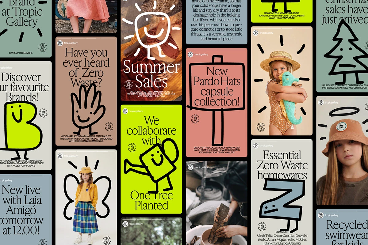
In a feed full of similar photographs, a drawn hand can say a lot. Illustration lets a brand add gestures, emotion and small stories without depending on another photoshoot every time. For 2027, we’d invest in characters that have a job to do in the communication and a personality people can recognise.
Tropic Gallery is a good example. Published in 2022 by Pràctica, Principi and SMLXL Company, the project documents an identity and social graphics update for a shop selling products for families. Its creatures, lettering and gestures work alongside photography, advertising and messages. Animation is credited to design_by_native, and the typeface is HB Hue by Berton Hasebe.
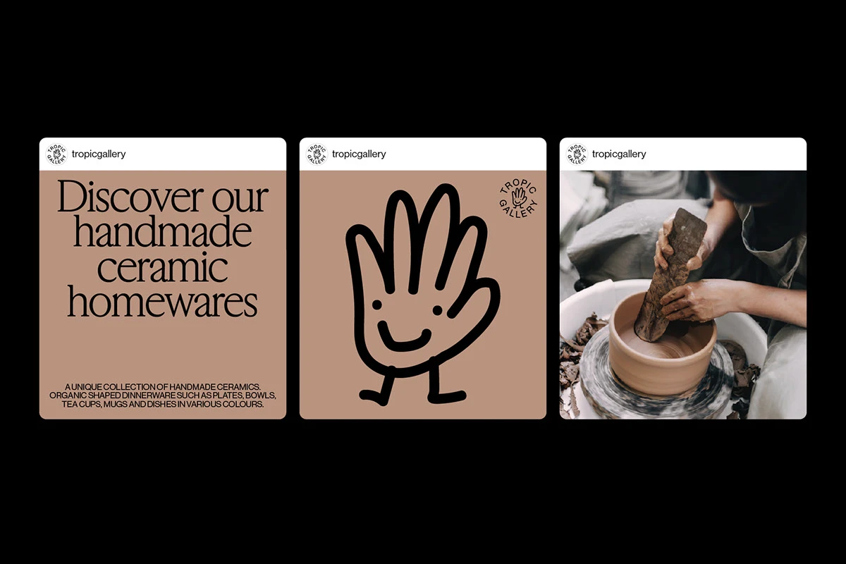
The exchange between illustration and product makes Tropic interesting. The creatures add gestures and humour, while the objects retain a clear role. The brand has resources for announcing something new and supporting an explanation without always reaching for another catalogue photograph. HB Hue contributes soft forms and a rhythm that feels at home with the characters.
A local brand doesn’t need to start with a cast of twenty mascots. It can test three gestures: one that invites, one that explains and one that celebrates. We’d define how they’re drawn, their size and when they appear. Then we’d check what they add to an offer, a frequently asked question and a team post. If they only decorate the page, there’s more work to do.
The tone needs boundaries. A friendly character can make an explanation approachable, but a sensitive question calls for clarity. In professional services, keep humour for situations that welcome it, and make sure facts, terms and instructions stay precise. A brand can be cheerful without turning every message into a joke.
It’s worth testing applications before commissioning a huge illustration library. Try a product sheet, an answer to a question and a seasonal advertisement. Check which character helps in each situation and how it reads on a phone. That small collection will tell you whether you’ve created a visual language with room to grow. A friendly monster that only works on a cover can be a good illustration, but it still needs development to support the brand’s everyday communication.
4 Campaigns that connect with culture
A cultural conversation can give a campaign an opening the product didn’t have on its own. When preparing for 2027, we’re interested in developing that connection across several pieces: an image that sparks curiosity, another that introduces the offer and others that bring it into a recognisable situation. The concept holds the campaign together; each instalment adds something.
Havaianas Puffed, presented by ASIA in 2026, combines product, fashion and popular culture. According to its authors, the launch connected with the context of The Devil Wears Prada 2 and included activations in several cities. The project shows fashion photography, dimensional type, graphic pieces and motion. Red gives the whole campaign a clear visual thread.
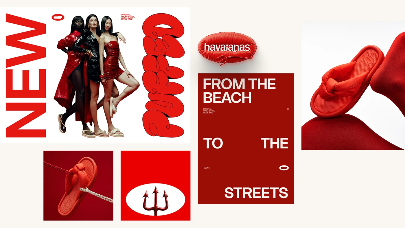
The lesson for a small business is coordination. A restaurant can build a campaign around a seasonal ingredient. A shop can introduce a collection through a colour and a situation in which people use it. A school can plan a themed week that connects free content, an activity and an invitation to explore its classes.
Imagine a café campaign built around its winter breakfast. The first piece introduces the ritual: coming in from the cold, sitting down and seeing the coffee arrive. The second shows the combination and its price. A third offers a choice between two versions. The last explains when it’s served and how to book. The same colour, framing or gesture links all four, but the message moves forward. Posting the cover four times just makes the poster longer.
The cultural connection has to make sense to your audience. A release, a local celebration or an industry conversation can provide a useful starting point. Before using names, materials or collaborations, check what you can use and what relationship actually exists. A cultural reference shouldn’t imply a partnership your business doesn’t have.
The conversation gives you material to adjust that sequence. If people ask whether takeaway is available, you have a piece to make. If they don’t understand what’s included, the offer needs a clearer explanation. A social campaign can learn while it’s running without losing its concept. Listening and responding matter just as much as preparing a launch with strong art direction.
5 Social SEO with questions and headlines people understand
A post can also appear when someone is looking for an answer. Preparing content for that situation changes the script: name the product, question and context instead of hiding them behind a clever headline only your team understands. Social SEO is a useful way to think about this part of content. You don’t need to pack every sentence with keywords. You need to make the subject clear.
The TikTok Next 2026 report explores journeys that begin or continue through search and comments. That’s a platform signal we’ll consider when planning for 2027. For the visual side, the identity for Fábio Malvezzi, designed by Felipe Guimarães and published in September 2026, offers a reference for hierarchy: oversized type, cut-outs and messages with a clear focal point. It’s a design case; the project doesn’t document search ranking results.
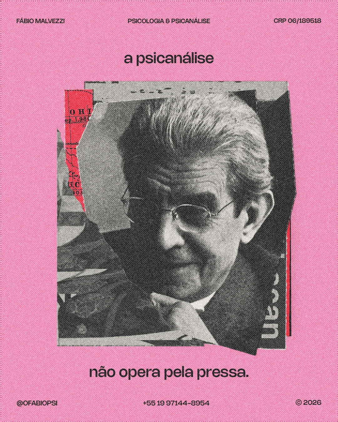
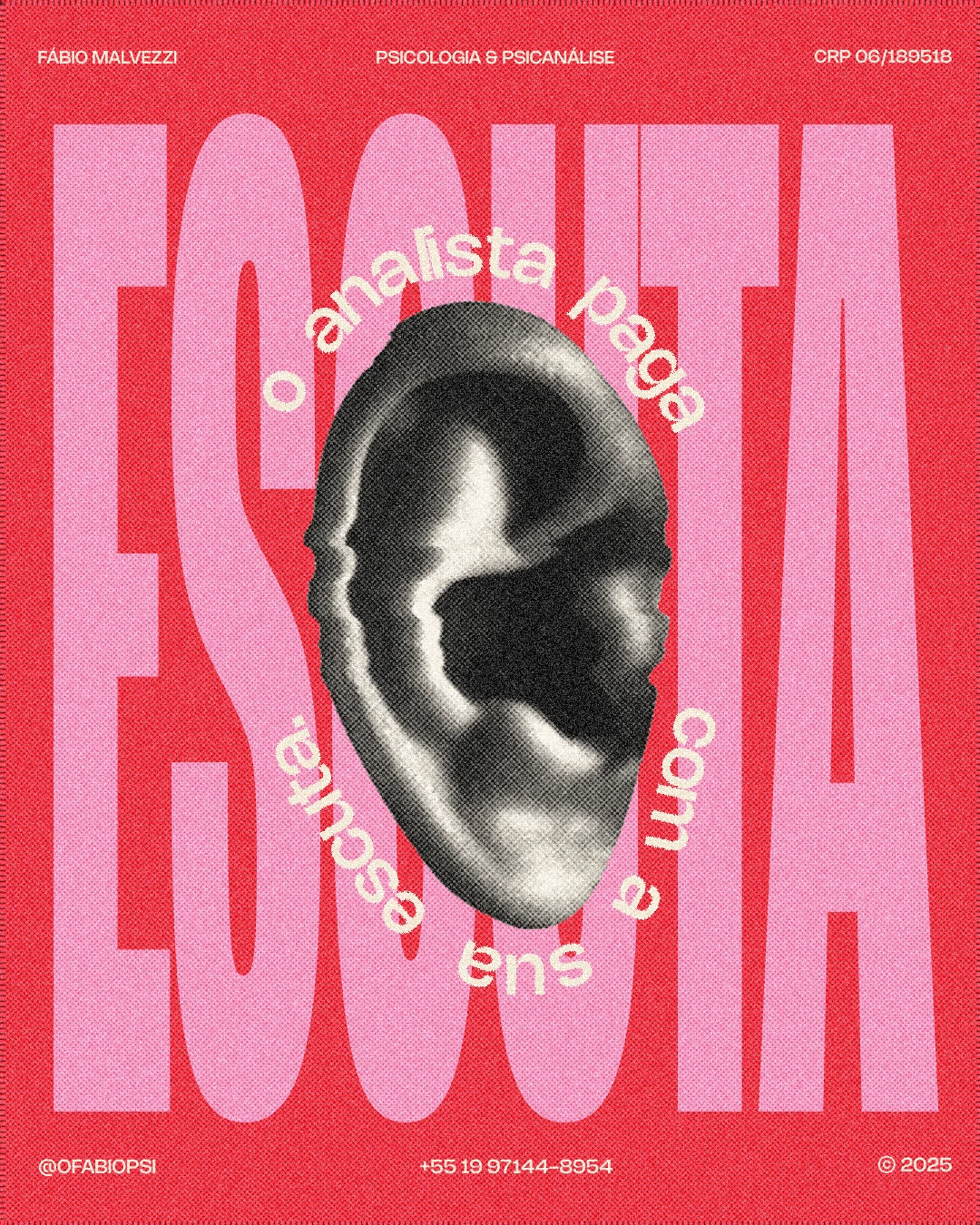
There’s an interesting tension in these images: the background word fills almost the entire piece, while the scrap of paper holds the sentence you need to read. Red and pink maintain the contrast, and the portrait introduces a recognisable voice. Your posts can use equally clear hierarchy with your own business content. The question is what someone needs to understand when they encounter that piece outside your profile.
A lighting shop could move from “Make your moments shine” to “How to choose a pendant light for a dining table”. The second line identifies a specific question and creates room for a demonstration. In the video, show width, height and the effect on the table; in the accompanying text, name the product category and explain what you’re comparing. Personality can still come through in the framing, colour and delivery.
Before writing, search for that question on the platform you’ll be using. Look at the related questions, the answers that keep appearing and the parts that remain unclear. Add what people ask at the counter, in messages or when requesting a quote. That combination helps you choose topics with a real connection to your service. Tool data is useful when available, but a search suggestion on its own doesn’t establish demand or search volume.
Then create a piece that answers one question. You can repeat it in the headline, say it naturally at the start of the video and use a precise description. Check that the profile explains what you do and where you work, if location matters. By the end of the explanation, someone should be able to find the relevant service. Specific information connects discovery with an enquiry; twenty generic hashtags won’t do that job for you.
6 Small communities built on conversation and activity
The TikTok Next 2026 report also focuses on groups brought together by specific interests and participation in comments. Our recommendation for 2027 is to work more carefully with those shared interests. A book club, a group learning a technique or people starting to run have things to talk about. That gives a brand a more useful role than interrupting the conversation with offers.
Tempo, an identity project presented by Omigunani, Soma Prayoga and WIIOZARD DESIGN in May 2026, offers an appealing visual direction for a running initiative. Its authors describe finding your own pace, balance and participation. A cream, green and brown palette, together with photography and the undulating name, supports that idea.
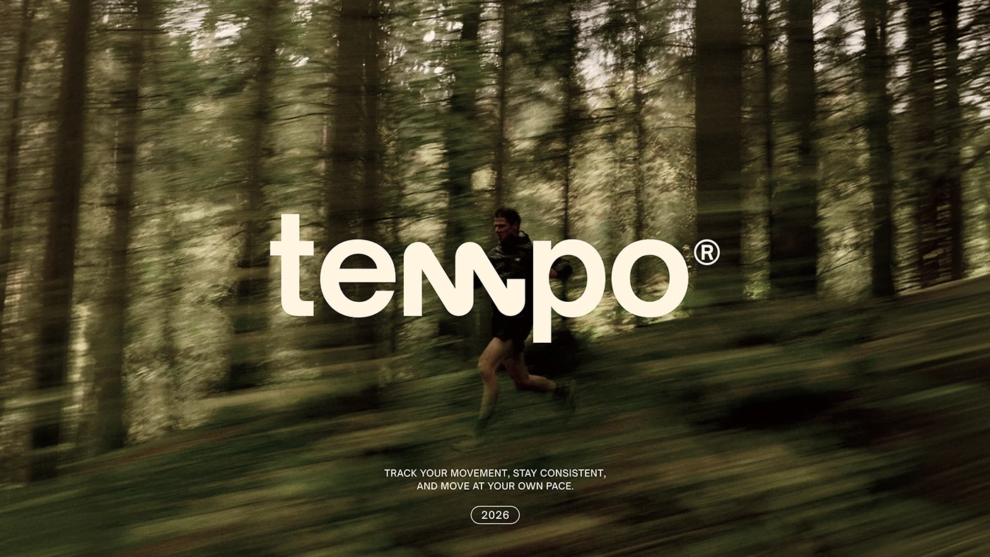
In Tempo, the undulating name and photographs of runners support an invitation to participate at your own pace. The graphics have energy without demanding the look of extreme competition. We’re interested in how the chosen imagery fits the people being invited. The Behance applications illustrate the identity; the activity below is our example of adapting the idea to a business.
A shop can organise a monthly demonstration. A café can host a book club. A gym can invite people to a beginner session with the level of difficulty clearly explained. The first step should be small and easy to understand: what will happen, who it’s for, how long it takes and how to join. The word “community” doesn’t replace those details.
Before the event, use social media to find out what would help people take part: the time, level, route or duration. Then you can show how the activity is being prepared, answer a question and share what you’ve learned. Comments become part of the content. A question with a useful answer deserves a post of its own; a conversation between participants can help you plan the next gathering.
Continuity needs someone in charge. If you invite people to an activity and nobody answers their questions, community remains a word in the bio. Agree on who will respond, what information they should provide and how bookings are collected. Then look at how many people attend and return. A small group that enjoys itself and comes back provides a much firmer basis for growth than a one-off post announcing, “We want to build a community!”
7 Content that says something about the person sharing it
We share some posts because they say something about us. A taste, a habit, an interest or a small victory. For 2027, we’re interested in content that gives the user a personal reason to bring the brand into their own conversation.
Spotify Wrapped 2025 combines listening statistics with short personal stories. Its official presentation shows cards you can send to friends or post on social media, a quiz about your top song and groups associated with listening habits. The marketing interest lies in where it puts the spotlight: the user has something to say about themselves. Spotify designs the occasion and the format.
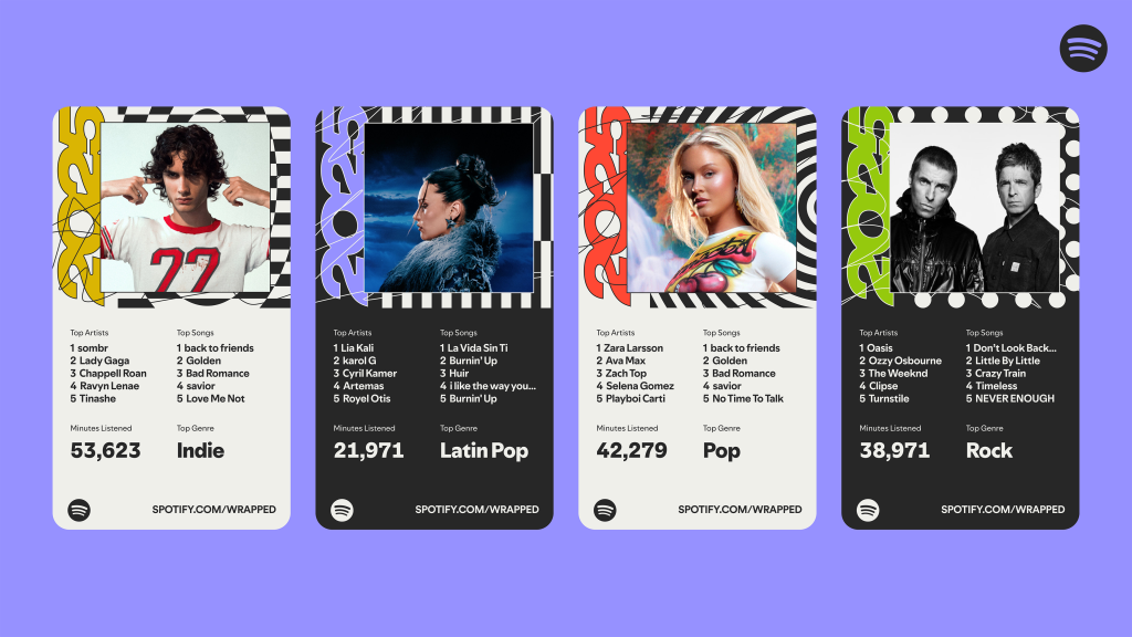
For a small business, the useful starting point is a creative question: which part of my offer could help someone express something about themselves? A bookshop can create selections for different kinds of readers. A school can prepare a card with a goal the student chooses. A sports shop can suggest different ways to enjoy an activity without turning everything into a competition.
A bookshop could create a card with three spaces: the book you recommend, the one that surprised you and the one you’d give as a gift. A language school could invite people to choose the situation they’d like to feel more confident in. You can begin with a template people fill in voluntarily, without building a data system. The result should make sense in their own conversation: a preference, a recommendation or a small achievement.
The tone needs care too. Categories can be fun, but rigid groups can exclude people who don’t identify with them. Design broad options, avoid judgement and make participation easy. For personal or sensitive subjects, voluntary preferences and general content are a better starting point than trying to turn private information into a public post.
Design the piece for the person who will share it. Leave room for their answer, keep the logo from swallowing the composition and explain how it works in one sentence. Prepare a vertical version if that’s where you want it to circulate. Then observe how people use it: an unexpected use might deserve a second edition. Participation brings original ideas as well as distribution.
8 Educational carousels worth saving
Explaining something well can be one of the best ways to introduce a business. For 2027, we want educational content with clarity, personality and an invitation to talk. A useful carousel can teach a principle, answer a question or help someone make a decision without looking like a presentation that escaped from a meeting.
The identity for Teen Talk, published by Evelyn Lobo and Blooomy Std. in January 2024, offers a lively visual reference. The project is for an English course, and its authors describe an active, conversational experience. The graphics combine strong colours, rhythmic lettering, photography and small drawings. Its social applications form a recognisable family even as their compositions vary.
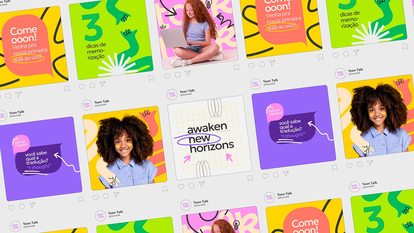
Teen Talk’s visual series combines large words with photographs, marks and small illustrations. There’s a recognisable family, but the pieces allow different rhythms. That flexibility is useful for an educational series: the cover attracts attention, a middle slide can concentrate on an explanation, and another can focus on an example. Maintaining an identity doesn’t require the same composition on every slide.
Take a practical example: a lighting shop wants to explain what to check before buying a pendant for the dining room. The cover names the question. The second slide shows the table and the area to be lit. The third compares two sizes. The fourth shows two heights. The fifth brings together the measurements to take to the shop. The carousel has a progression that helps people decide. It doesn’t need fifteen slides to prove it’s educational.
A school can use a scene and three expressions to practise within it. A renovation business can show which photographs it needs to assess a job. A professional can compare two situations people often confuse. Every slide needs a purpose and comfortable reading on a phone. If the copy ends up in tiny type, cut it, split it or change the example. The format should make the explanation easier.
The closing slide brings the lesson together and offers a proportionate next step: save the measurements, browse a product category or ask about a specific situation. That action relates to the content before it. Asking people to save, comment, share, follow and buy all at once turns the ending into a miniature megaphone. A clear invitation also helps the team understand which responses it will need to handle.
If you work in the pharmacy sector, we’ve prepared 25 social media post ideas for pharmacies. The visual direction can have personality, while topics and claims are reviewed with the professional judgement the sector requires.
How to apply these trends to your social media strategy in 2027
The selection might make you want to change everything on Monday. Before opening twenty fronts, choose an objective and two content strands you can sustain. For a lighting shop, those could be product demonstrations and answers to questions about choosing a light. Identity, video and carousels then support those two strands. The calendar starts with the content you need rather than with empty boxes to fill.
Choose the channel for the audience and the job it needs to do. On Instagram, you can combine visual posts, demonstrations and conversations through the profile. TikTok may make sense if you can explain, test or participate with a voice of your own and keep doing that work. YouTube lets you build a continuing collection of demonstrations and answers that people can also find through search. For a B2B business, investigate whether LinkedIn brings together the people involved in purchasing and what professional explanations you can contribute. The same brand needs to adapt its content to the context.
Write a short brief for each piece. For example: “Help someone understand which two measurements they need before choosing a pendant light.” Then define who appears, which product is used, where you film and what information accompanies the video. If paid advertising is planned, prepare versions and a production budget from the start. A calendar that relies on improvising everything at the last minute ends up using whatever is available.
When reviewing results, distinguish discovery, interest and enquiries. Views explain part of the reach; viewing time helps you assess the piece; saves and questions provide context on its usefulness. Category visits, messages about a particular model and bookings show a more specific commercial step. Those indicators won’t be available in the same way on every platform. Combine the data you have with the questions your team receives, and compare pieces with similar objectives.
At Lead the Mood, our social media management brings together visual direction, content and business objectives. If you’re based in the Maresme, explore our social media services for businesses in Mataró. If you need to organise your resources first, read our guide to the cost of social media management for a business.
Your 2027 plan can start small and still have plenty of personality: an explanation of your own, a product shown well and a visual language people recognise. Once that works, you have material for more formats, a creator collaboration or a campaign. The feed can get interesting. Better still if people understand what you sell and why it’s worth taking a closer look.
Social media trends 2027 FAQs
Which social media trends work best for small businesses?
The ones you can sustain with your own information and resources. Product photography in context, explanations of real questions and a recognisable visual identity are good starting points. You can then add motion, illustration or community activities if they help communicate what makes your business different.
Should every social media post be a video?
Choose the format according to what you need to show. Video is useful for a process or an experience. A carousel can explain steps and compare options. An image can deliver a short message with real impact. Variety with a clear purpose is usually easier to sustain than turning every idea into a video.
Can I use these references with a small budget?
Yes. Take the creative principle and adapt it to your resources. You can work with good lighting, a clear headline, two layouts and a simple campaign sequence. References help you observe design decisions. Other brands’ original materials, characters and systems belong to their respective creators and rights holders.
Why does a selection for 2027 include projects from before 2026?
2027 is the year we’re planning for. The cases show resources we can study today and retain their original dates. Platform signals link to their documentation; the recommendations for brands and local businesses are our editorial interpretation of those signals and the visual projects.
How can I tell whether a trend is helping my business?
Start by defining the action you want. A demonstration might lead to a product enquiry; an activity, to a registration; an explanation, to a better-informed question. Record those responses and the production effort, then review several pieces working towards the same objective. A video designed for reach and a carousel answering a question do different jobs. Evaluate them with that difference in mind.
To turn these content ideas into a broader plan, continue with our digital marketing trends for 2027. If you want to see how an idea develops across multiple pieces, our selection of advertising campaigns to inspire 2027 lets you compare creative direction, formats and participation.
Before commissioning production around these ideas, read how to choose a social media agency in 2027. It includes a brief, a proposal comparison matrix and questions about filming, approvals and enquiry handling, so your creative plan has a team and a scope you can sustain.
Editorial selection and analysis by Lead the Mood. Images and audiovisual pieces are shown as references to the projects analysed, with links to their sources and credits. Brands and work belong to their respective rights holders. Original publication dates range from 2022 to 2026; this is an inspiration and planning edition for 2027.