The best advertising campaigns to inspire your 2027 marketing have something in common: you can explain the idea before listing the formats. We have selected twelve real projects for their concept, art direction and ability to carry one idea across several executions. Expect collaborations you can hold, local stories, wonderfully unruly characters and experiences that keep going after the click. The aim is to find a useful creative approach for your brand and give it a reason of its own.
There is an apron turned into a football shirt, a property platform brave enough to borrow from Renaissance painting, and a furniture brand playing with horror. There is business technology, too. B2B marketing deserves a life beyond that endless stock library of people shaking hands.
Written in October 2026, this is an inspiration selection for planning 2027. Each case retains its actual year, from 2022 to 2026, and a link to the creator or brand. “Best” reflects our creative judgement rather than an effectiveness ranking: we analyse what the projects show and mention results only when the source publishes them. The underlying question is which decision you could use when developing a new campaign.
At Lead the Mood, our question is down to earth: what can your brand learn from all this? If you are planning the year ahead, pair this selection with our digital marketing trends for 2027. Here, we look closely at individual campaigns, the details that make them recognisable and the decisions behind their rollout.
1 Heinz and Kappa turn a trade into a team
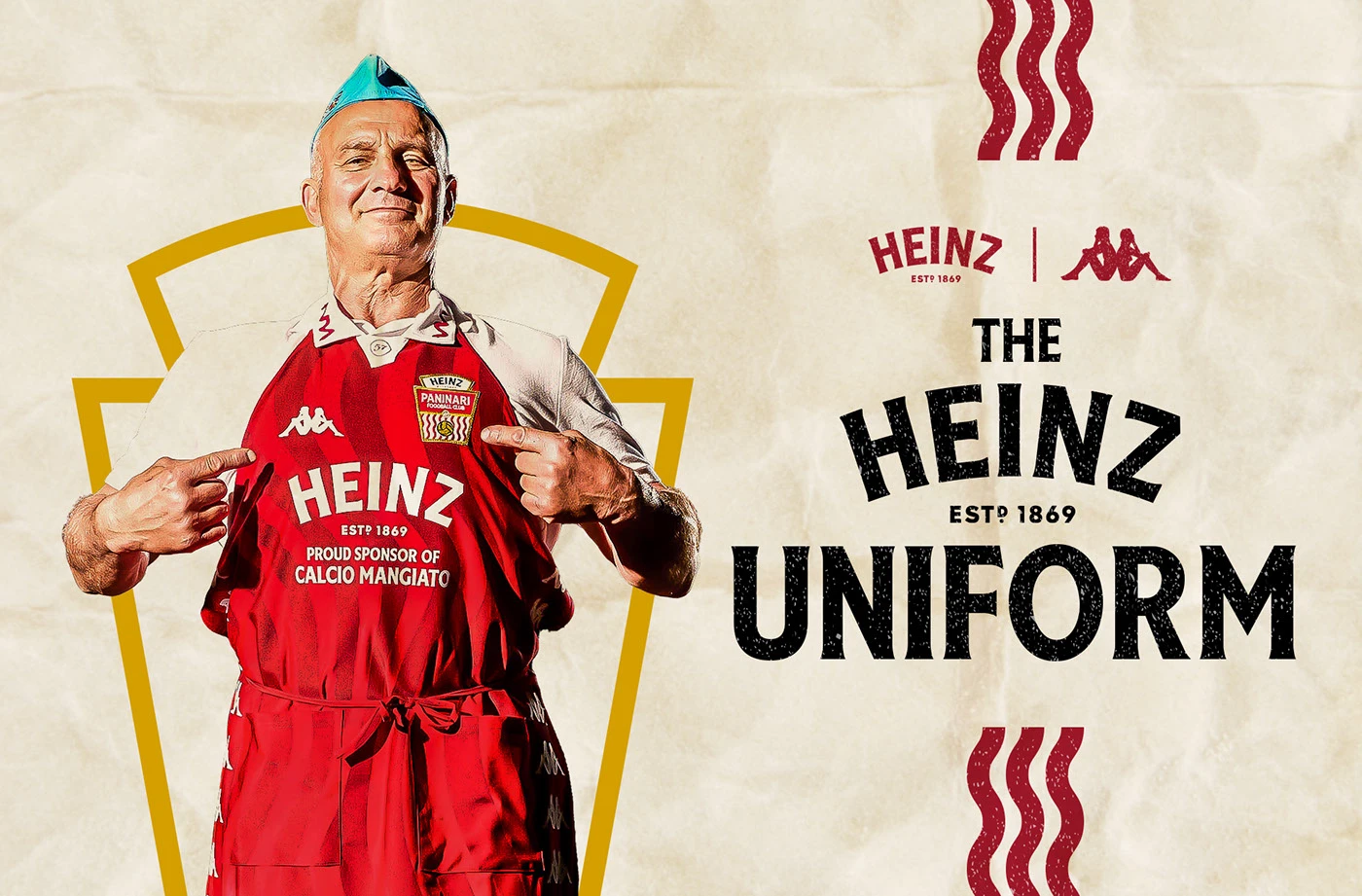
A collaboration has more potential when it uncovers a relationship that already exists in real life. Heinz and Kappa find that connection between the people making sandwiches at Italian food stands and the world of football. The Heinz Uniform, developed by DUDE Milano in 2024, dresses the paninari as members of a club: crest, shirt, portraits and a shared sense of pride.
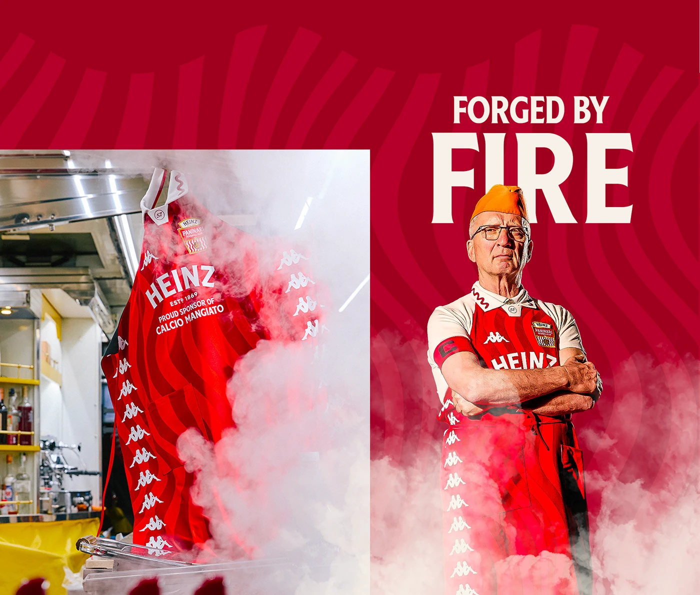
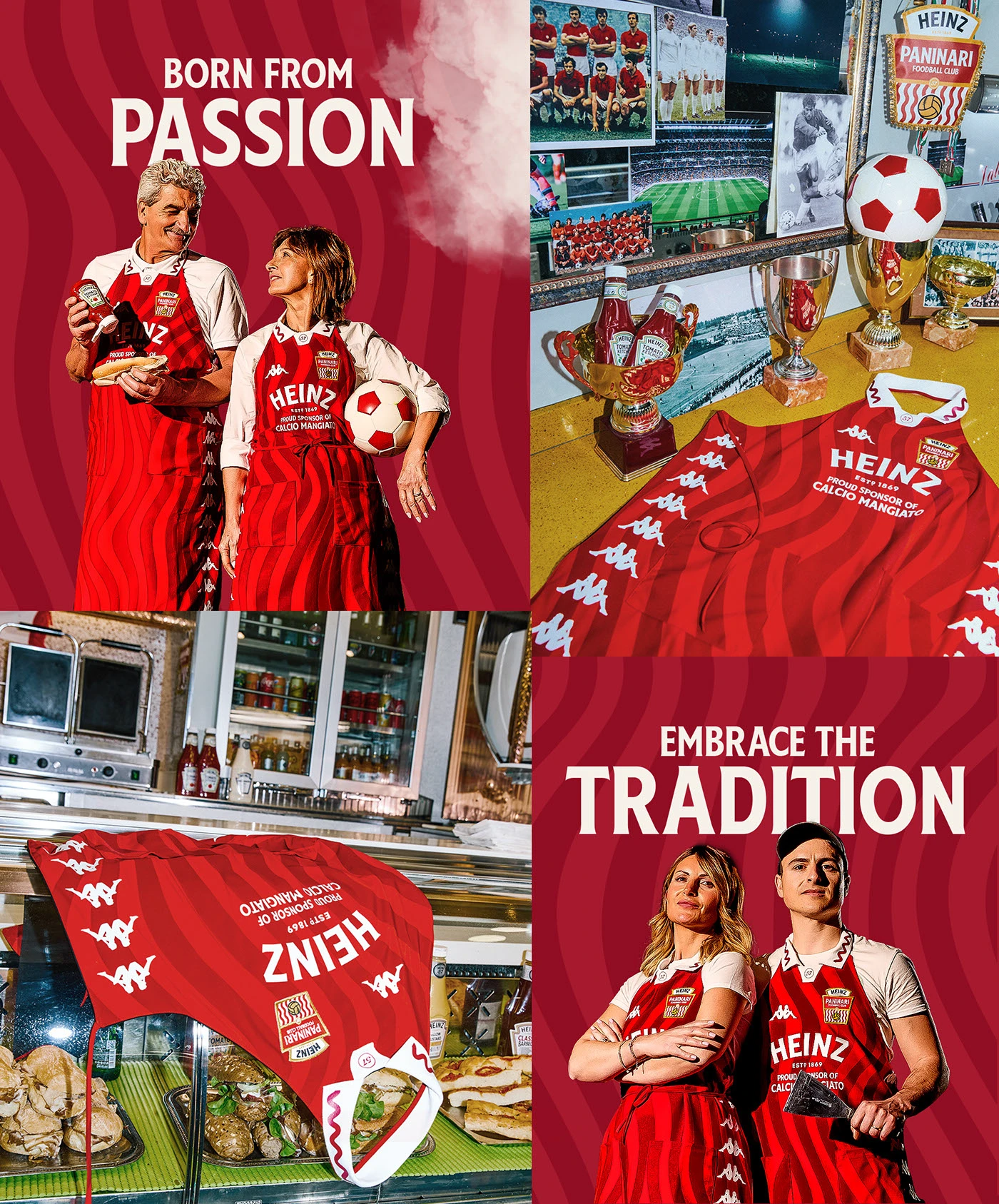
The clever part is that you can touch the partnership. The apron borrows from sports kit while remaining connected to the wearer’s job. In the photographs, red fabric, embroidered crests and team poses give an everyday scene the visual weight of a football squad unveiling. The humour comes from elevating the trade without turning the people into caricatures.
Our reading is that putting the object at the heart of the story gives the campaign coherence. One post can show the uniform, another the person wearing it, and another their workplace. They all lead back to the same idea. That makes it easier to produce different pieces without switching arguments halfway through.
How to apply it to your brand. If you run a shop, cooperative or business whose service depends on particular professionals, start by learning their symbols and routines. A collaboration might make sense as a tool, an item of clothing or a small everyday object. Design something that belongs in their world, then explain why it exists. A shoot with real people and a strong concept can have more personality than a range of giveaways with two enormous logos.
2 Nike brings Las Vegas into every execution
For Super Bowl LVIII in 2024, Forth+Back takes Nike’s NFL season campaign identity into the setting of Las Vegas. The project includes graphic rules, illustrations, visual treatments, motion, and applications for print and digital media. Burn and Broad contributes 3D illustration and animation.
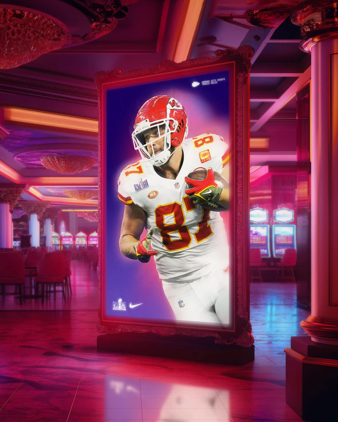
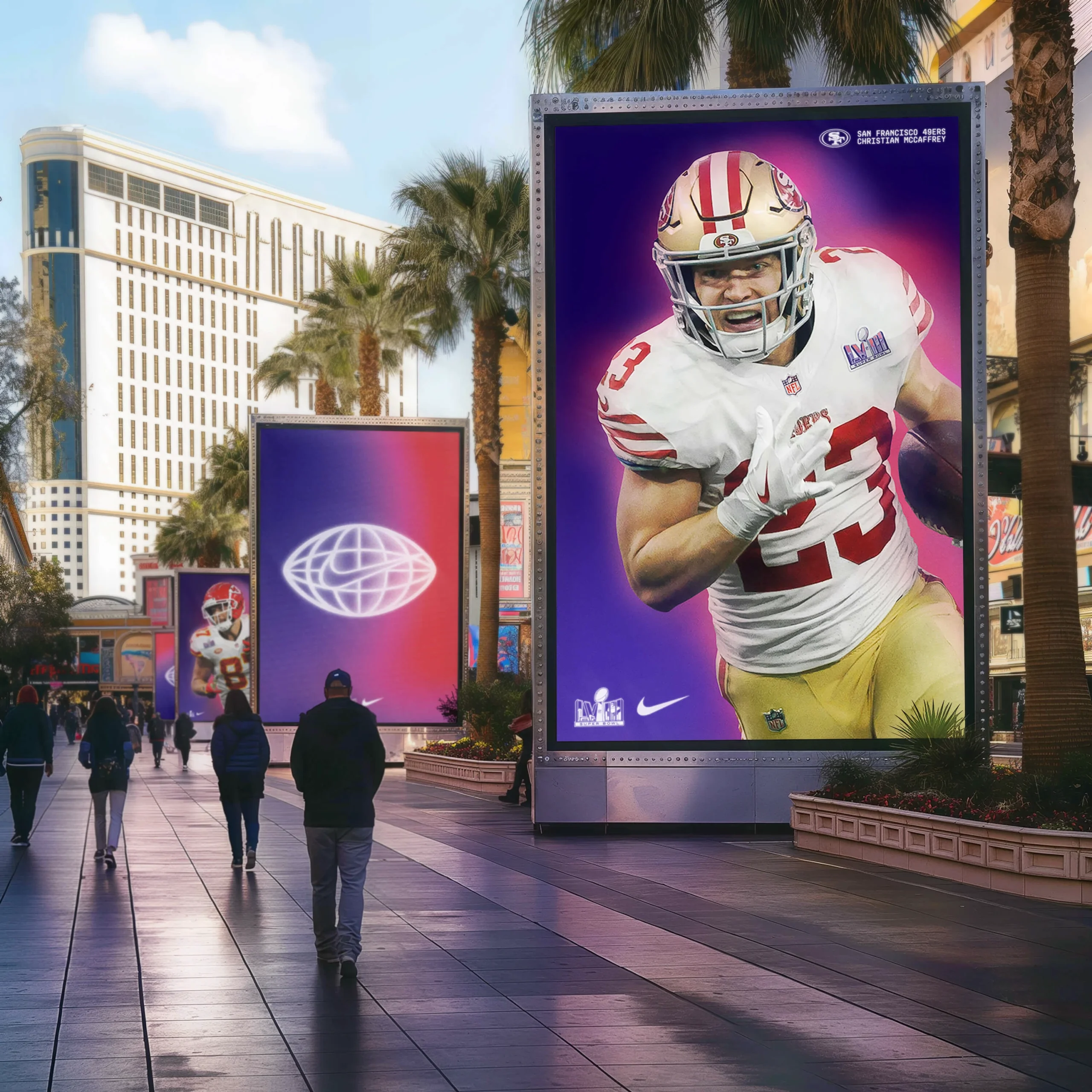
The images have a very particular temperature: magenta, violet, highlights and the dazzling excess we associate with the city. The player remains the focus, but the atmosphere makes the ad belong to that event. It does not feel like an everyday campaign with the host city’s name added in a corner.
For marketing, the interesting relationship is between context and system. The art direction has enough character to attract attention and enough rules to keep adaptations recognisably part of the same launch. The identity can move from a vertical ad to video without each supplier having to invent a new campaign.
How to apply it to your brand. If you are planning an opening, anniversary or event, find something specific to the place and the occasion. Define a lead image, a palette, a rule for text and an approach to motion. Then test those decisions in the three formats you will actually use. A recognisable campaign across your shop window, social channels and booking page is worth more than twenty versions that share only a logo.
3 Converse makes its mark through attitude and motion
DTMG.tv presents We Leave Your Mark for Converse, a 2023 project published in January 2024. Diego Troiano art-directs a series of promotional videos for stores in Spain. The concept draws on making a mark in skateboarding and basketball: patterns, textures and colour build a voice for a young, sport-connected audience. That relationship explains the energy in the collage and typography.
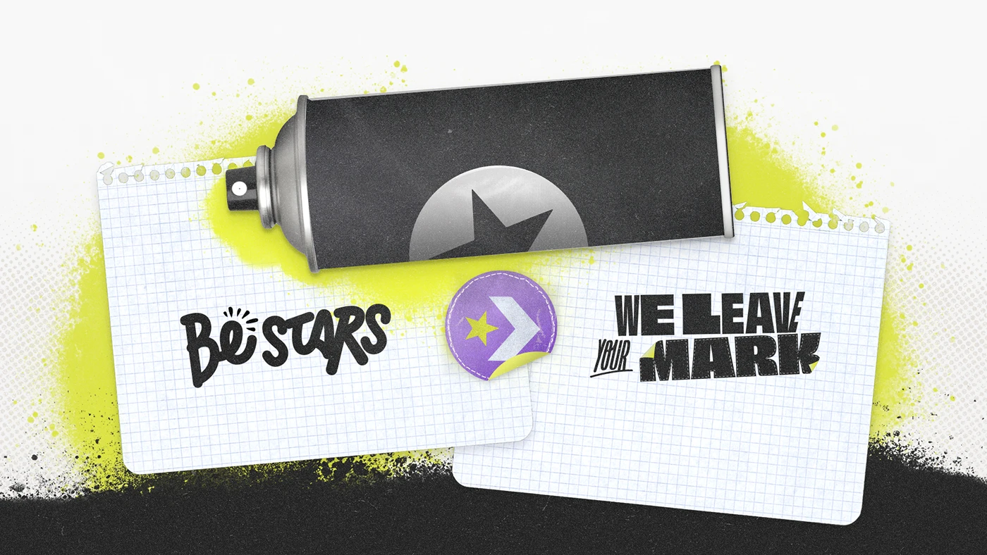
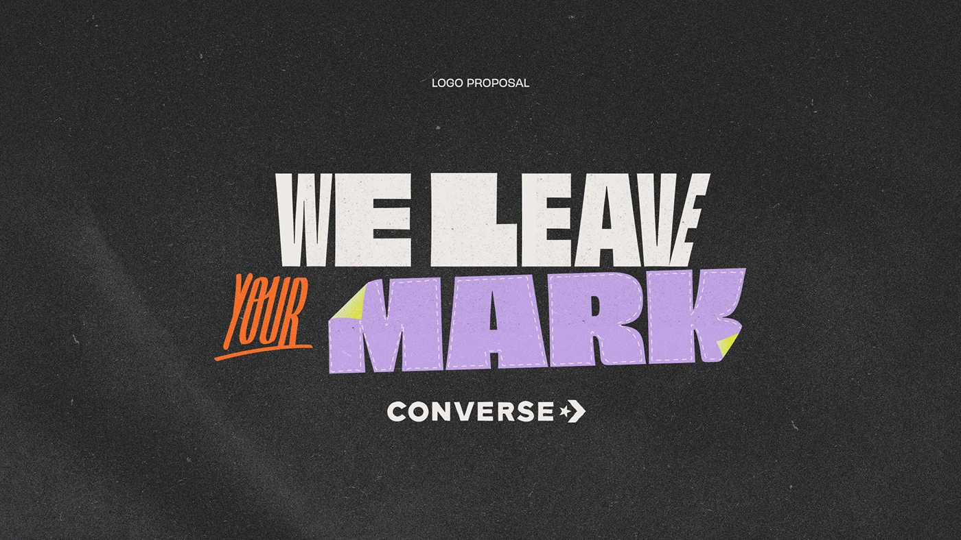
It has the energy of a notebook that someone has enthusiastically taken over: graph paper, spray paint, stickers, cut-outs and letters jostling for space. Orange and lilac break up the black and white. The star plays a part in the composition rather than sitting still as a signature on the ad.
We like the way that attitude is spread across several elements. Remove one and the others still carry the visual voice. That is a useful test for any campaign: does it have personality beyond its hero execution? In motion, rhythm and transitions can express the same idea as the lettering in a still image.
How to apply it to your brand. Find materials your audience recognises as its own and turn them into design decisions. For a music school, that might be notation; for a workshop, the marks made by its tools. Then agree on a way to animate them that makes sense. A randomly purchased texture will not give you authenticity. A vocabulary rooted in the product or community can help you speak with a more distinctive voice.
4 Netflix builds belonging through local culture
Hecho en Argentina is a Netflix campaign developed by Mutato BA and Monks in 2022. Caro Sáenz is credited with art direction and brand design; the presentation documents a shared language across content, video and outdoor advertising.
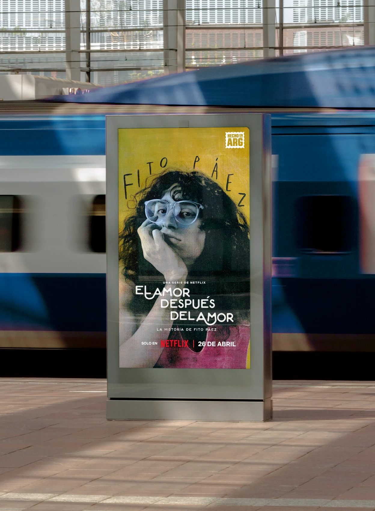
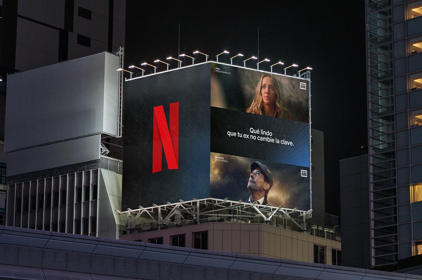
The campaign mark is compact and forceful, almost like a stamp. It can sit alongside photographs from very different worlds without stripping away their character. In the outdoor ad, Netflix red and text over the imagery make the speaker recognisable, while the scenes preserve the closeness of their protagonists.
The lesson concerns belonging. An international brand finds a local idea and turns it into a meeting point for several stories. Our interpretation is that this umbrella lets the brand talk about a catalogue without reducing it to a grid of products. Each title contributes a voice; the campaign contributes a relationship between them.
How to apply it to your brand. For a business in Mataró, the Maresme or Barcelona, local character might lie in the creators, expressions, collaborators or ways of working. Research it before decorating everything with a landmark. A series of supplier and customer portraits, with a shared signature and a carefully chosen question, can explain your connection to the area. That connection needs to be real, and the people need something to say. Local pride works better when people recognise it in details than when it is announced in an empty slogan.
5 Havaianas changes the product’s context
Published in 2026, Havaianas Puffed is an ASIA Publicidade project bringing together art direction, photography, 3D and motion. The credits list Manoel Michael and Paulo Rogério for design, Studio Pond for 3D, Murilo Pontes for motion, and MAR+VIN and Xico Buny for photography.
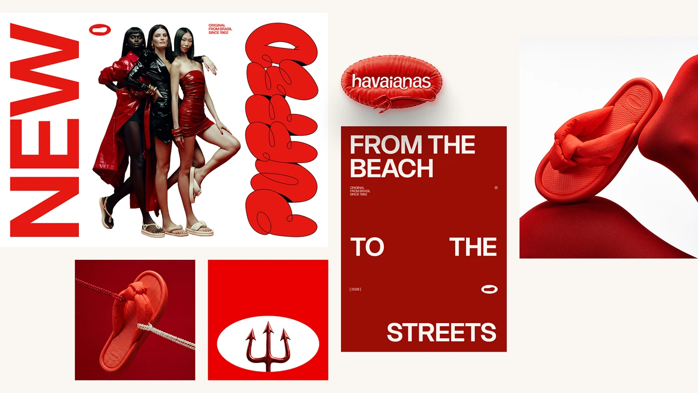
The campaign places a sandal in a world of fashion and street style. Red, soft surfaces, styled photography and dimensional lettering share a physical quality. The product seems to belong to the same world as its advertising. There is no need for a lengthy explanation: much of the argument is carried by how the image feels.
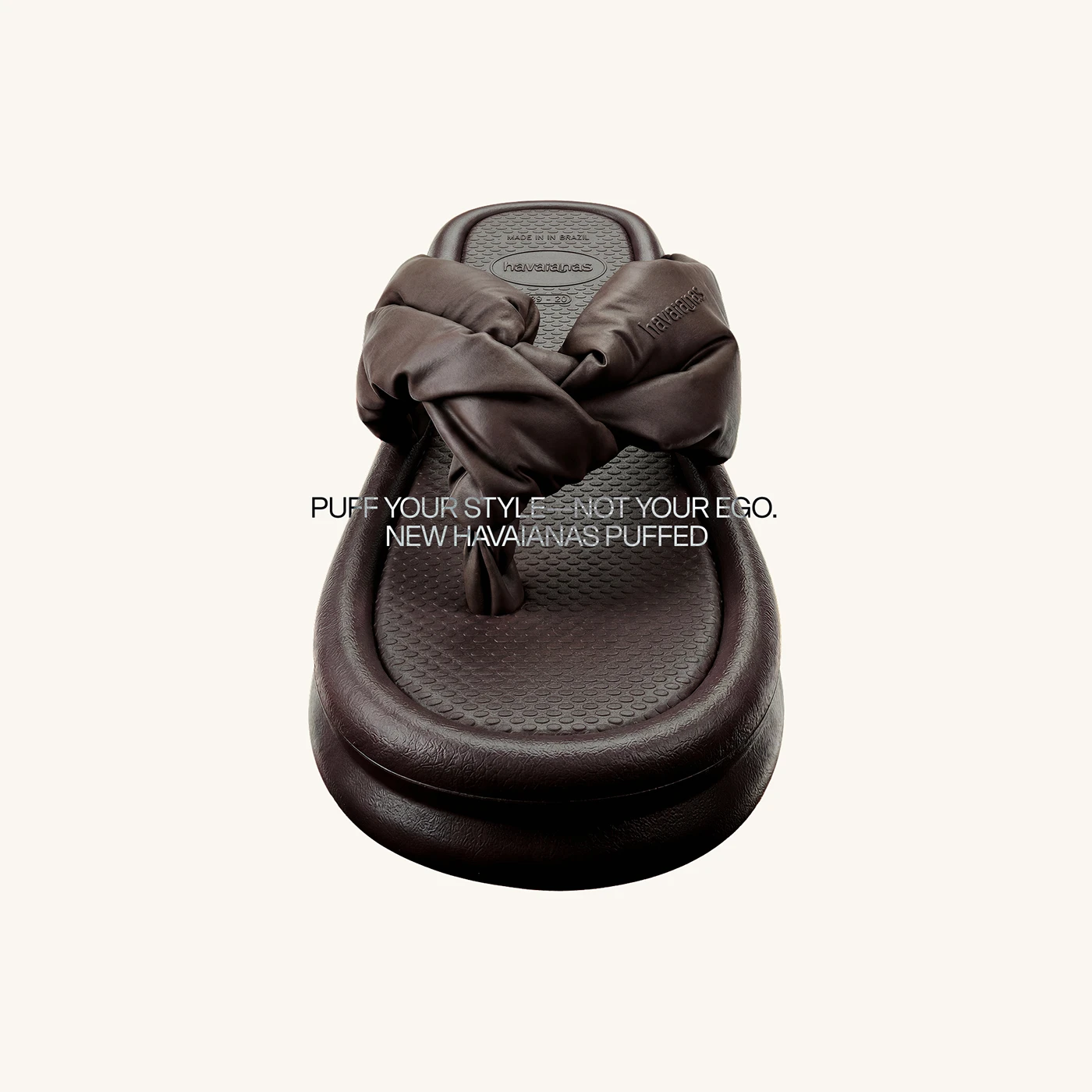
For us, the most useful decision is changing the situation in which we imagine the product. The brand can open up another occasion for use without denying its origins. Design builds that transition while retaining recognisable references. It introduces something new without turning all the communication into a specification sheet.
How to apply it to your brand. If you want a product to fit a different occasion, portray that occasion convincingly. A drink might accompany a particular moment; a professional service might appear in the setting where it removes a difficulty. Define what changes for the person and let photography, copy and composition tell that story together. If you only change the photograph’s background, you probably have not changed how people see the product.
6 Guinness opens its world to an illustrator
Lovely Day for a Guinness, the brand’s US summer campaign for 2025, brings Sebastian Curi’s illustrations to cans and packaging, with Vault49 and Starpower. In his presentation, published in December 2025, the artist also documents photography and video for social channels, including sketches and moments at work in his studio. The collaboration has both an object and a production story to share.
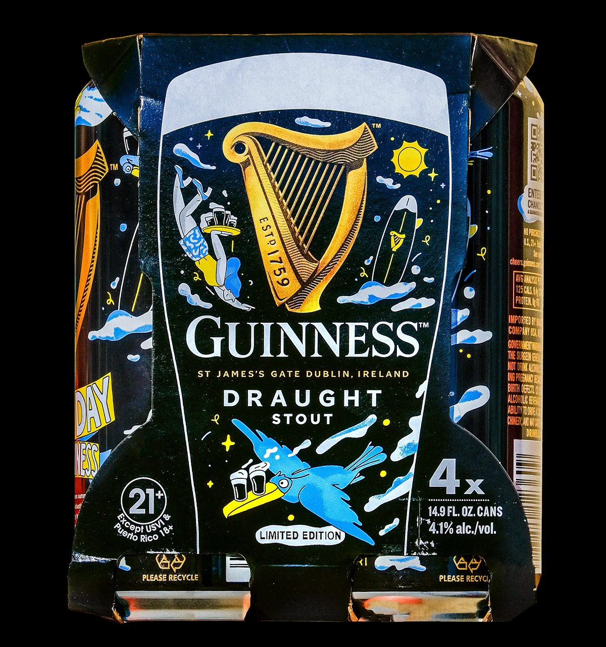
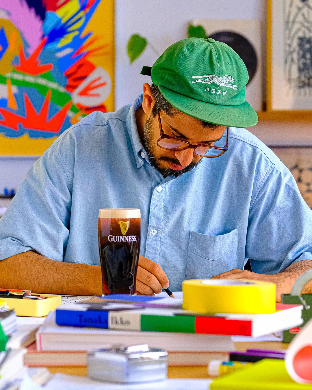
The black base, golden harp and typography keep a clear connection to the brand. Characters, flowers and colourful gestures introduce a different voice on top. You can see the collaboration in the drawing and the small details of the packaging. It has enough presence to make the intervention recognisable without erasing the product it accompanies.
We are also interested in seeing the illustrator at work. That image gives the edition context and creates material around the creative decisions. Process need not be a last-minute addition: it can be part of the story from the beginning, provided there is something specific to show.
How to apply it to your brand. When you collaborate with a creator, choose someone whose voice has a meaningful relationship with what you sell, and give them room to develop it. Agree on applications from the start: the object, in-store material, photography and social content. A smaller brand can make a limited edition or intervene on an existing surface. What matters is that the collaboration has a reason and the work is properly credited. Treating an illustration as decorative filler wastes much of its storytelling value.
7 Pepsi turns the city into an advertising canvas
Pepsi Murals documents Rui Granjo’s work for the summer 2024 campaign in Poland. The creator describes a commission for murals and billboards in nine cities, extending the brand’s food and music language. Aytaç Öztürk and Granjo are credited for the icons; goodlooking.pl produces the murals. Some applications use projection and ultraviolet light: the setting and lighting are part of the result.
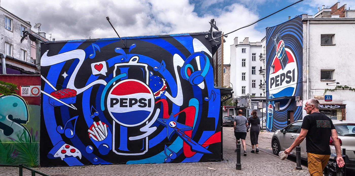
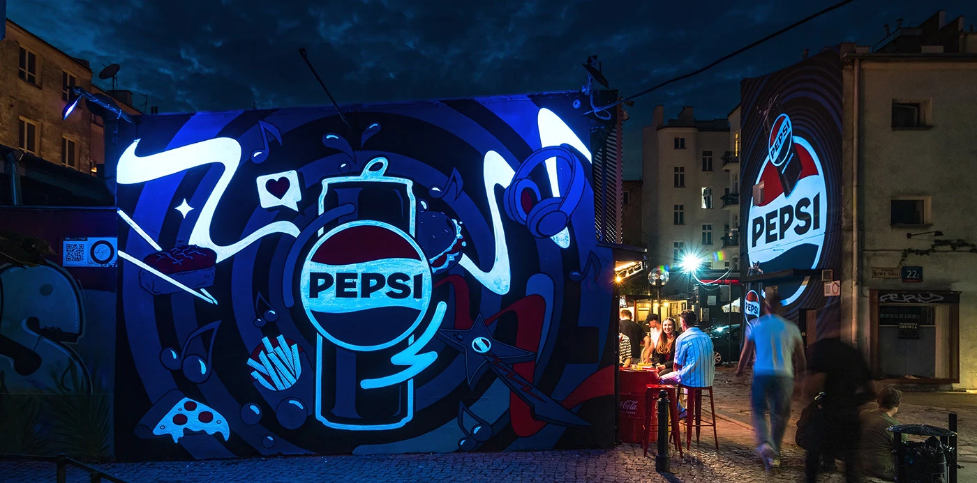
The intense blue acts as a recognisable signal from a distance. Music, food and summer elements surround the product without losing the composition’s structure. The paired images show how lighting changes the mural’s presence. The surface is more than a neutral rectangle: it shapes how we experience the campaign.
This is a reminder that a strong outdoor advertising idea has to work in a real situation. There are buildings, traffic, other brands, passing people and changing light. Detail size, hierarchy and contrast are chosen for that setting, not for a presentation studied at leisure on a computer.
How to apply it to your brand. A shop window, collection point or event entrance might be your main advertising surface. Design for that place first: where people view it from, how long they have to read and which action makes sense. Then document the intervention to turn it into content. Consider both the experience of someone walking past and the photograph or video that will circulate later. The physical piece and its digital story can strengthen each other.
8 StreetEasy paints the homebuying journey
Let the Journey Begin, StreetEasy’s 2024 campaign created with BUCK and Mother New York, uses digital painting with Renaissance references to depict scenes from the search for a home. The studio’s presentation shows illustrations, development and applications, including a mural produced by Colossal.
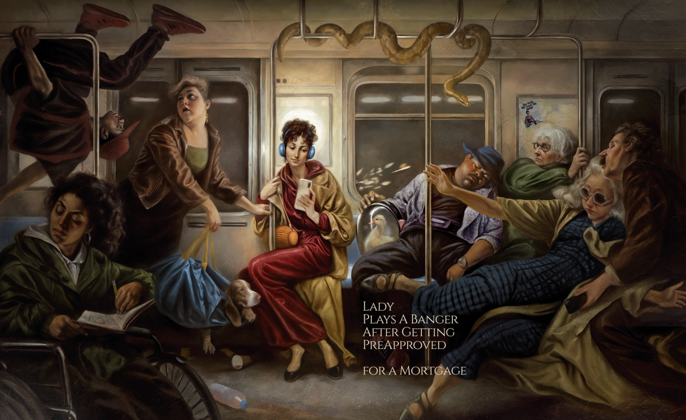
It is a delicious decision: portraying New York property life as scenes from a grand painting. The gestures, lighting and sheer number of characters invite you to stop and look. The public transport scene combines that solemn treatment with contemporary details that bring the story back to the street.
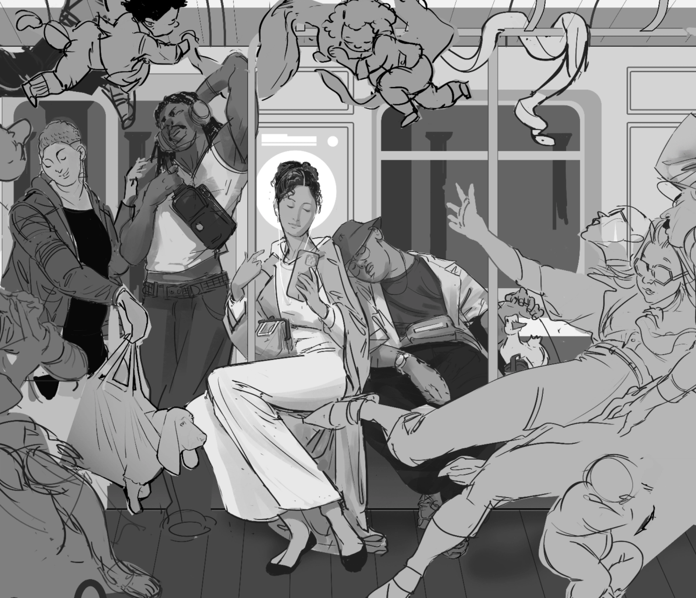
The campaign finds personality in a process many businesses depict with interchangeable icons. Our reading is that visual exaggeration helps people recognise the emotions involved: anticipation, doubt, excitement and decisions. The service stays central because the stories grow out of its situations, even though the imagery departs from the sector’s usual visual codes.
How to apply it to your brand. Identify a moment your customers remember intensely. It could be a first visit, a delivery, a difficult choice or the relief of solving a problem. Give it a narrative and art direction worthy of that moment. For a service business, explaining the experience before and after is often more concrete than declaring the team professional. Imagination helps when it illuminates a recognisable experience; on its own, it simply adds spectacle.
9 Australian Open brings different styles together
BUCK and BMF develop pieces for the 2024 and 2025 editions of Australian Open using a mix of animation styles and techniques. The case brings together different visual worlds that express the personality of the tournament, its players and the surrounding experience.
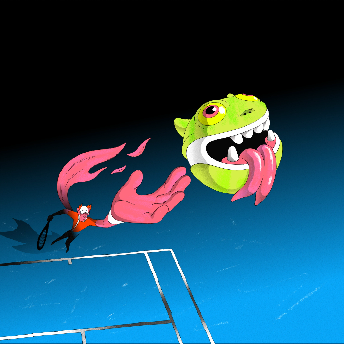

We move from a fantastical character to a tennis scene featuring a gigantic wolf. The images use different registers, but movement, sport and celebration place them in a shared world. Together, they create the pleasure of wondering what the next shot will bring.
We like this because it shows that coherence does not require absolute uniformity. A campaign can have variety when a clear direction organises the mix. Problems arise when each format changes subject, tone and purpose without a reason. Here, visual diversity is part of the project’s idea.
How to apply it to your brand. For a festival, cultural programme or collection with several product families, first define the idea that brings them together. You can then allow different illustrators, styles or treatments within shared rules. Decide what stays consistent: structure, closing sequence, rhythm or signature. With a smaller budget, combine two well-executed languages and check that their relationship is clear. Collecting techniques just to show them off can complicate production without improving the message.
10 Spotify makes an annual edition an event
For Wrapped 2025, Spotify presents a campaign combining graphic expressions of its symbol, visual materials and outdoor advertising. Its official explanation describes an identity mixing analogue and digital references. The images document how that edition unfolds in the city, beyond the screens displaying personal listening results.
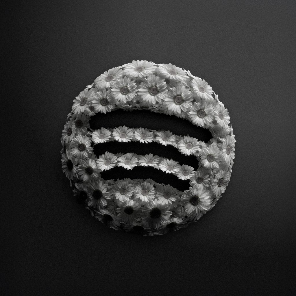
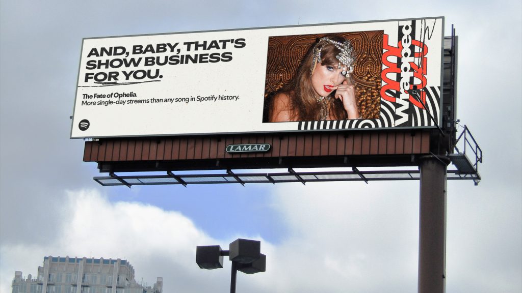
The flower-built symbol and the billboard with its bold typographic composition do different jobs. One expresses the flexibility of the visual world; the other turns a piece of data or a music story into a public message. The edition retains a recognisable identity while making room for different artists and situations.
The idea that interests us for 2027 is creating a moment of your own that can return. Annual repetition provides a structure; creative renewal keeps that structure from becoming a dull routine. A good edition has something new to communicate, even when its name and approximate timing are familiar.
How to apply it to your brand. Consider whether there is an annual milestone worth gathering your activity around: a project selection, a useful customer review, a seasonal guide or a collaborative edition. Give it a name, a selection principle and a visual approach that can evolve. Data should be understandable and have a reason to be shared. Saying you have posted often matters less than showing what you have learnt, what you have made or what the people following you can use.
11 IKEA turns a household problem into a game
IKEA’s Convive Mejor takes domestic conflicts into a world of humour and horror. /nk.studio documents the 2025 digital experience, with games and interactions linking those situations to new products.
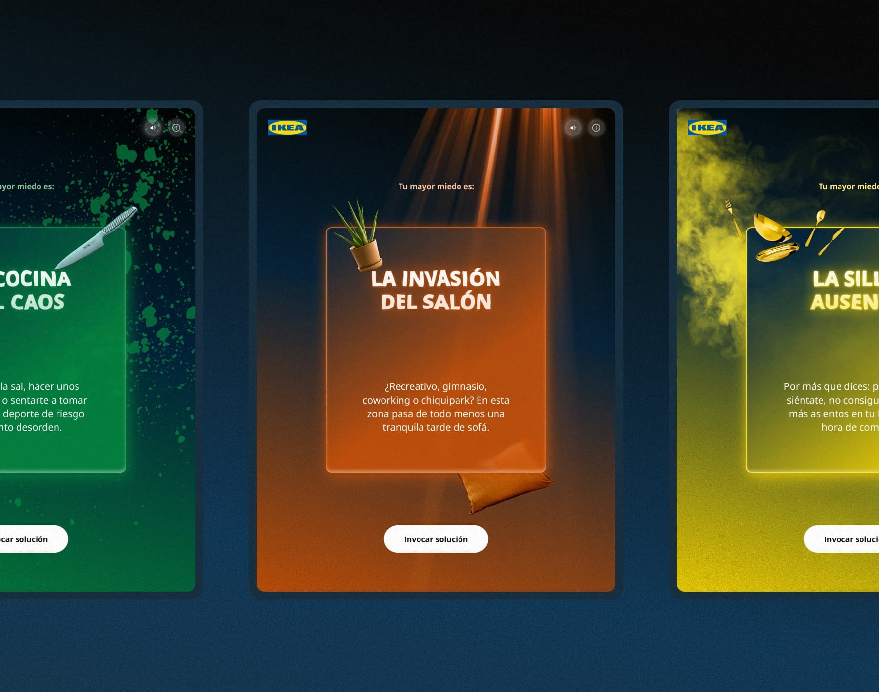
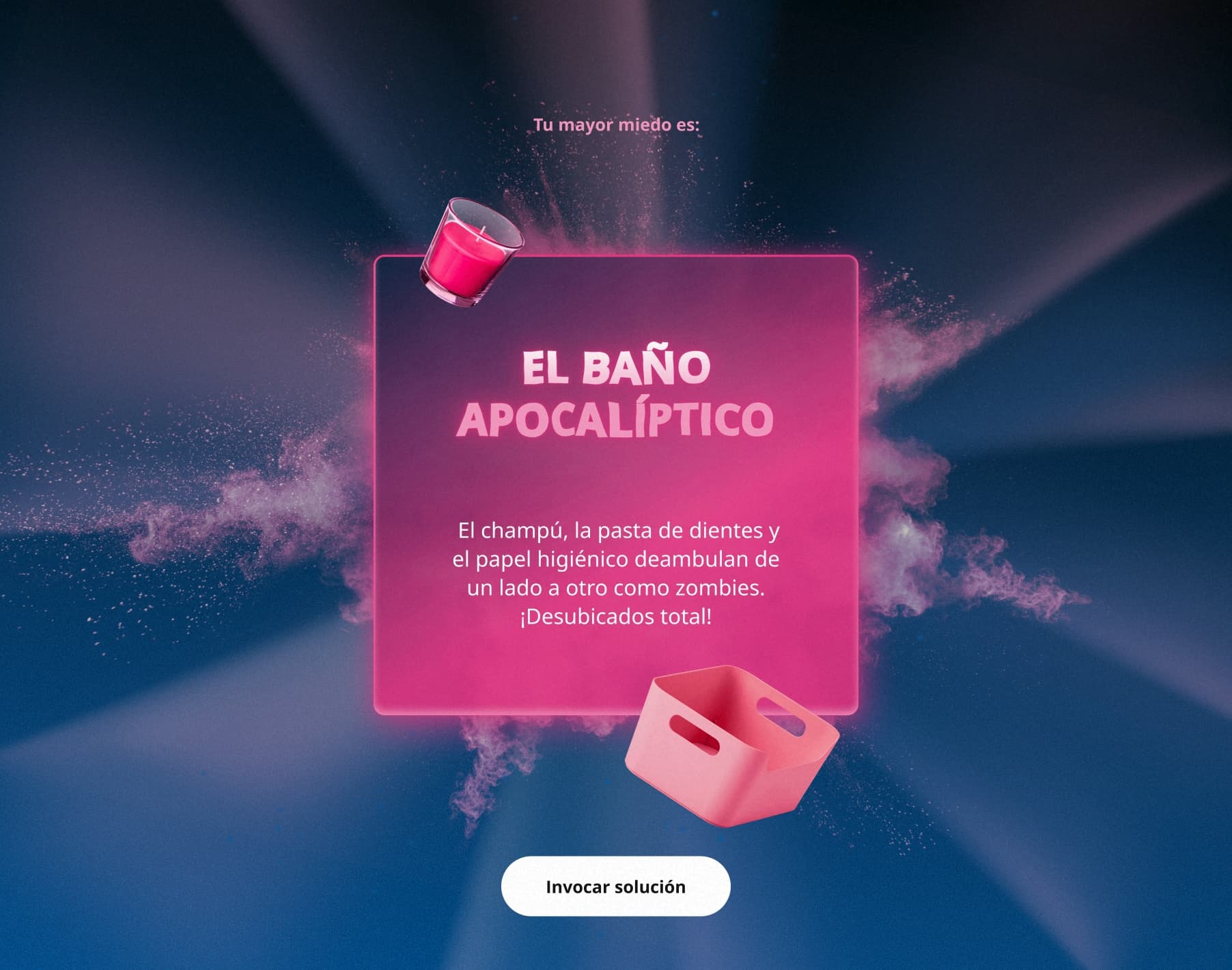
The kitchen and bathroom become film sets, with floating objects and a button inviting you to “summon” a solution. The visual language and interface develop the same game. After the ad, there is still a story to explore.
The case also includes a business result: /nk.studio reports a difference of 4.7 percentage points in the rate of buyers of new products between participants and a control group. The figure is attributed to the studio, whose summary does not provide the full methodology. It helps distinguish commercial impact from participation or clicks. A digital campaign can measure both, but they answer different questions.
How to apply it to your brand. Review the question your ad opens up and the answer its landing page provides. If you advertise a solution to a specific problem, the first screen should acknowledge it and help the visitor move forward. A short questionnaire, guided selection or demonstration can work if it simplifies the decision. In our web design work, that continuity starts with the campaign concept and receives the same care as the images and copy.
12 Samsung spotlights the people who make change happen
Find Your How is the 2025 work Freddy Gomez presents for Samsung Business. The campaign focuses on the people who turn a vision into something that works. HOW becomes a graphic device framing situations and protagonists from different professional environments.
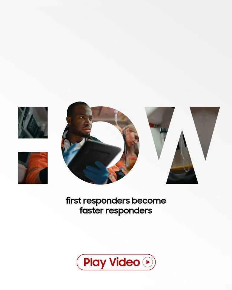
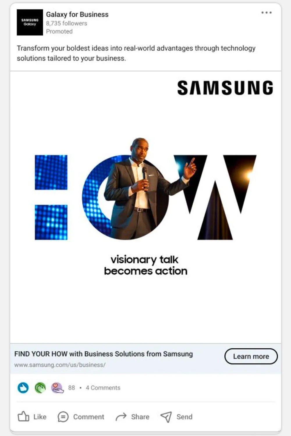
There is plenty of white space, oversized lettering and photography integrated into the word. The composition makes the concept visible. In the social execution, the message retains that structure and shows a person at work rather than filling the piece with a product list.
Samsung places its argument in a familiar B2B task: turning a vision into something that works. The protagonist is the person responsible for making it happen, and technology gains meaning within that job. For an industrial business, that shift can help choose an opening message: the problem it solves for a maintenance or production manager. Specifications and demonstrations can follow; first, make clear which job the solution makes easier.
How to apply it to your brand. Choose a customer profile and a situation you know well. Build a campaign around that task and support it with concrete evidence on the landing page: a process, case study, demonstration or explanation from the team. In content for industrial companies, showing knowledge of the customer’s work helps build a more specific commercial argument. Creativity should clarify that argument, without hiding it behind a concept nobody can translate into practice.
How to plan a 2027 advertising campaign using these references
After all those images, it is tempting to open twenty folders and ask for a campaign with everything in it. Better to choose. References help us recognise creative approaches, make decisions and explain what we want to the team. If we save only the finished look, we will end up chasing an aesthetic that may have little to do with our brand.
Start with the change you need to achieve
Write the brief around an audience, a situation and a change you want to achieve. For example: “Help maintenance managers discover our inspection service before the annual shutdown and request an assessment.” That sentence helps choose protagonists, information and destination. It is far more useful than asking for “a powerful campaign for everyone”. Then specify what you can demonstrate and which conditions the person needs to understand before taking the next step.
The objective should help you choose what to show and what to measure. If you want commercial enquiries, prepare the form, the necessary information and the team’s response. If you want a first visit, explain the location and the reason to come. Creativity does not end when someone approves the ad.
Choose an approach and give it a reason of its own
A collaboration, local story, visual transformation of the product or dramatised situation are possible routes. Choose one with a demonstrable connection to your business. You should be able to explain in a sentence why that idea belongs to your brand. If the explanation is simply that it is fashionable, there is still work to do.
| Challenge | Useful reference | Decision to study |
|---|---|---|
| Give value to a community or collaboration | Heinz x Kappa and Guinness | An object or edition that makes the idea tangible |
| Launch a product for a different occasion | Havaianas Puffed | The context, styling and visual qualities of the product |
| Activate a moment or place | Nike and Pepsi | A system designed for its real setting |
| Build a story of belonging | Netflix and Spotify | A shared signature across several stories |
| Explain a service or solution | StreetEasy, IKEA and Samsung | The customer experience and the next step |
Design a lead execution and a system for adaptations
Prepare a lead execution and three adaptations with different jobs. For that inspection service, one might introduce the situation, another show a step in the process, and another explain what information is needed to request an assessment. Test each composition in the format where it will appear. A vertical ad needs its own reading order, and a video needs to establish its argument early. Adapting a campaign means deciding what each execution shows as well as changing its dimensions.
That system should grow out of your brand identity and allow new expressions without losing recognition. Decide which elements are fixed and where variation is welcome. Agreeing these rules before production reduces the revisions that arise when every piece seems to come from a different team.
Plan distribution and destination together
Think about what each channel contributes. Advertising can introduce the idea, social media can develop it, and email marketing can follow up with people already showing interest. The destination should offer an action that fits the moment: view a collection, understand a service, book or request information.
For planning social formats, see our social media trends for 2027 as well. Channel choice and production need to match your actual resources. A small, well-connected campaign can be easier to sustain and assess than a simultaneous launch across many outlets with nobody clearly responsible.
Define how you will interpret the response
Separate the response to the ad from the commercial journey. Track visits, enquiries received and enquiries that fit the service where you can identify them. If there are clicks but no contacts, review the destination and offer. If enquiries come from the wrong customer profile, review the message and distribution. If a suitable enquiry arrives and then goes nowhere, talk to the person handling it. Changing the initial design will not solve all those situations.
Compare periods in context: investment, channel, offer and capacity to respond. Keep a record of the questions the campaign prompted and the materials that were hardest to produce. That record helps decide what to retain for the next edition. With few responses, differences are only indicative, so keep learning before declaring success. The final folder should include that assessment alongside the published files.
Frequently asked questions about advertising campaigns for 2027
Were these campaigns released in 2027?
No. They are real earlier projects, with their years stated, selected to inspire planning for 2027. We examine ideas and creative decisions that may help when developing a new campaign. We do not present future activity as though it has already happened.
What makes a good advertising campaign?
An idea that is relevant to the brand, understandable across its formats and connected to a coherent experience. Visual quality matters because it helps express and recognise that idea. Assessing commercial effectiveness requires objectives and case data; an image gallery alone cannot tell you how much a campaign sold.
Can a small business use these ideas?
Yes, if it adapts the approach to its circumstances. It can work with local protagonists, create an intervention at its premises or produce a series with carefully considered art direction. Start with an idea the business can execute and sustain well, and a clear destination for anyone who wants to know more.
How can you use Behance as a campaign reference?
Look at the full project, credits, date and applications. Distinguish a brand-commissioned campaign from a personal exercise or an unpublished proposal. Then note which decision interests you and why. Taking inspiration from a project’s thinking helps you develop your own solution; reproducing its images or identity in your advertising is not the aim.
Where should I start when planning marketing for 2027?
Review your offer, audience, brand and the journey from a first impression to an enquiry or purchase. Then define a priority and a campaign to support it. At Lead the Mood, we can help organise that starting point with a digital audit and develop the concept, content and applications. If you already have a launch in mind, tell us what you want to achieve.
Editorial selection and analysis by Lead the Mood for 2027 planning. Visual references belong to the credited projects and creators. Each link leads to the original presentation and its credits. The suggested adaptations are our interpretation of each case and do not imply guaranteed results.